
The Five Elements Behind Every Floral Design
Jul 03, 2026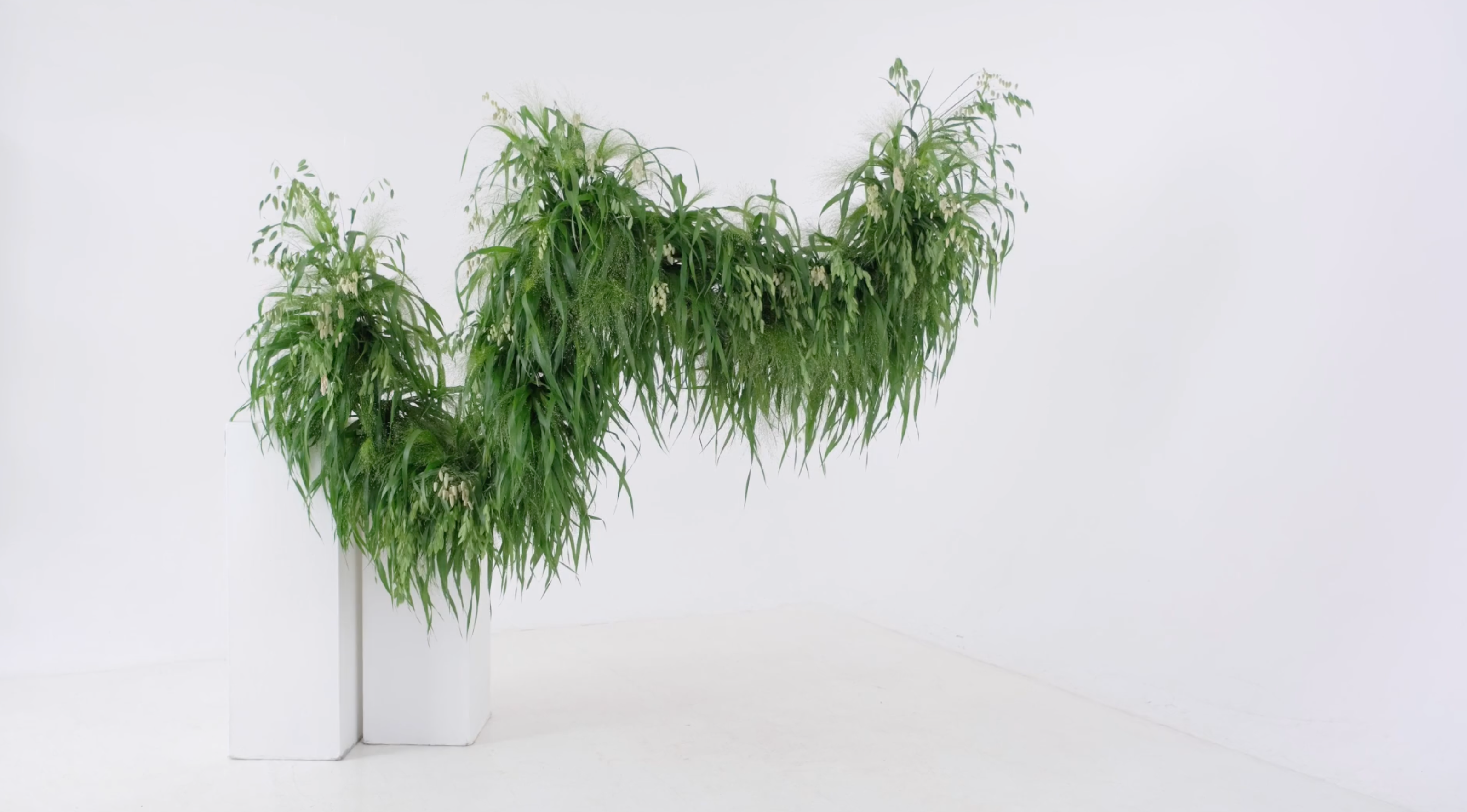
Image - On Grasses from The Installations Masterclass
Have you ever finished a floral design, stepped back from it and known that something just isn’t quite right, without being able to put your finger on exactly what it is?
The flowers might be beautiful, the colour palette could be everything you’d hoped for and, for once, the mechanics may have behaved themselves perfectly, but somehow ... the finished piece still doesn’t feel quite as resolved as you’d imagined.
It happens to all of us. Sometimes a design comes together almost instinctively, and each flower seems to find exactly the place it was meant to occupy. At other times, we can move the same stem six times, turn the entire arrangement around, photograph it from three different angles and still feel as though we’re missing something.
And that remains true whether we’re working on a small arrangement at the bench or standing beneath an installation with a ladder beside us, wondering whether the whole thing needs one more branch or whether, in fact, it needs rather less.
I’ve certainly been there more times than I can count.
This is one of the reasons I return so often to the Elements of Floral Design: form, line, colour, texture and space. The name can sound a little grand and theoretical, I know, but in practice the elements are incredibly useful. They give us a way to move beyond simply deciding whether we like or dislike something and begin to understand what’s actually happening within the work.
They’re present in everything we create, from one perfectly chosen branch in a vase to a hand-tied bouquet, a centrepiece or an installation stretching across an entire room. The scale, materials and mechanics might change considerably, but those same five elements are still there, influencing each decision.
I’ve explored them throughout The Flower School book, in classrooms around the world, inside Flower Class and within my installation teaching because, for me, the theory should never feel separate from the flowers themselves. These aren’t five words to memorise and then promptly forget. They’re tools we can return to when something feels uncertain, when we want to push a design a little further or when we’d simply like to understand why a particular piece works so beautifully.
Form: deciding what the design wants to be
Form is essentially the shape of a composition, but I think it does rather more than simply describe the outline. It tells us what the design is trying to be, what sort of energy it carries and how it intends to sit within the space around it.
Even a single stem has form. A tall delphinium standing upright creates something very different from a curling branch reaching out across a table, or a heavy amaranthus stem falling down the side of a vessel. Before we’ve added anything else, that first material has already started to tell us something about the shape and energy of the finished work.
As we begin bringing more flowers together, we’re making decisions about whether the finished piece will feel symmetrical or asymmetrical, bold or soft, tightly defined or more fluid around the edges.
Symmetry can feel classical, formal and stately. We see that same sense of order in grand buildings, monuments and traditional architecture, where everything feels balanced, measured and reassuringly composed. Asymmetry tends to feel more dynamic and contemporary, allowing the eye to move through the flowers in a less predictable way.
Neither is better than the other, of course. They simply create different feelings.
The useful question is what you want the design to communicate before you become completely absorbed in the detail. Should it feel generous and romantic, restrained and architectural, wild and garden-inspired, or perhaps crisp and deliberately formal?
At a larger scale, form also determines how an installation relates to the room around it. Is it framing a doorway, rising above a table, sweeping across a wall or appearing to grow quite naturally through the architecture? The flowers may be beautiful in isolation, but the form still needs to make sense within the space they’ve been asked to transform.
A design can quite easily drift away from its original intention once we’re in the middle of making it. You might begin with something loose and asymmetrical, then step back twenty minutes later and discover that it has somehow become rather round, balanced and polite. Equally, a symmetrical design could lose its impact if one side begins wandering off and doing something entirely of its own accord.
I often think form is the decision beneath all the other decisions. Once you understand the shape, energy and character of the piece, the flowers have something to respond to.
Line: showing the eye where to travel
Line is one of the less obvious elements, but it holds an enormous amount of power. Most people will notice colour first, followed perhaps by the overall form or the textures within the flowers, while line tends to sit underneath all of that, quietly guiding the eye from one placement to another.
In classical floral design, line was often very clear. You might see a progression of carnations or chrysanthemums moving through a composition in a strong, visible rhythm, each placement leading neatly to the next.
Contemporary floral work often uses line in a softer and more fluid way. A branch might take the eye upwards, a repeated colour could move us gently across the flowers, or a sweep of foliage might connect two focal areas without creating an obvious stripe through the arrangement.
The most successful lines are often the ones we experience without immediately noticing. Your eye moves comfortably through the design, but you don’t necessarily stop and think, “There’s the line.”
This becomes particularly interesting when we begin working at a larger scale because the viewer might approach the flowers from across a room, pass beneath them, walk around them or see them framed through a doorway. An installation has to make sense from more than one fixed viewpoint, and line is often what helps the eye travel through something which may be far larger than the viewer themselves.
But exactly the same thing is happening in a smaller arrangement at the bench. When you turn the design around, does your eye still travel comfortably through it, or is there one dense area which seems to swallow all the attention? Do the placements feel as though they’re speaking to one another, or are they simply several lovely flowers sitting in close proximity?
Line creates that conversation. It’s often what turns a collection of beautiful materials into a composition.
Colour: beautiful, powerful and occasionally rather distracting
Colour is the richest of the five elements, and it’s usually the first thing our eyes register when we look at a floral design. It can alter the mood of a piece almost instantly, making it feel joyful, romantic, calm, dramatic, fresh or wonderfully decadent before we’ve consciously considered anything else.
I should probably confess that I have a slightly complicated relationship with colour.
Of course, I love it. There are particular tones and combinations which can completely stop me in my tracks, and flowers give us access to the most extraordinary range of colour. From the deepest, almost-black chocolate cosmos to the softest blush sweet pea, there’s an entire world waiting for us.
But I also think colour can occasionally be asked to do rather too much of the work.
A beautiful palette can be so immediately seductive that we overlook uncertain lines, weaker placements or a form which hasn’t quite been resolved. The colour is gorgeous, so we forgive everything happening underneath it.
This is one of the reasons I often teach using monochromatic or analogous harmonies, where the colours are more closely connected. A quieter palette allows us to see the structure with greater honesty. We can notice the form, follow the line and understand the placements without being completely carried away by a spectacular contrast.
Colour can be especially powerful in installation work because it doesn’t only affect the flowers; it can alter the atmosphere of the entire setting. A wash of soft green might make a room feel calm and immersive, while a sharper contrast could create something far more theatrical.
The larger the work becomes, though, the more important it is that colour supports the form and line rather than trying to compensate for them. A spectacular palette might draw people into the room, but once they’re there, the design itself still needs to hold their attention.
That doesn’t mean every design should be subtle, pale or restrained. Far from it. Strong colour can be absolutely delicious, but it should contribute to the idea rather than becoming the whole idea.
It’s worth considering what the palette is actually doing. Is it strengthening the atmosphere you want to create? Does it make sense within the room, season or occasion? Is it working alongside the other elements, or is it being asked to carry the entire design on its back?
Texture: giving the eye something more to discover
Texture is one of my favourite elements and, frankly, I don’t think we shout about it nearly enough.
When we talk about texture in floral design, we’re not only considering how something physically feels in our hands. More often, we’re responding to visual texture: how a material appears that it might feel.
A glossy anthurium leaf, a rough branch, a papery poppy pod, a soft grass or a cloud of clematis seed heads will all create completely different sensations, even before anyone reaches out to touch them.
Texture can also alter the way we experience colour. The same burgundy tone could feel rich and velvety in a dahlia, sharper through a glossy leaf, or dry and earthy in a seed head. The colour might be similar, but the feeling is entirely different.
There’s an extraordinary world of botanical texture available to us, and some of the most interesting materials aren’t necessarily the ones trying to be the star of the show. Scabiosa seed heads, grasses, berries, bark, curling leaves and all those wonderfully strange little botanical details can bring so much character to a piece.
Texture also behaves differently at scale. Some materials need to be used generously before their character can be read from across a room, while others reveal themselves only when someone moves closer.
A mass of grasses can create movement and atmosphere from a distance, while the smaller details (a rough seed head, a curling leaf or a soft velvety petal) reward the person who takes another step towards the work. That balance between the overall impression and the closer discovery is one of the things I find so exciting about installation design.
The temptation, naturally, is to use everything. I understand that temptation extremely well.
But texture works best when it supports the character of the design rather than simply adding variety for the sake of it. Sometimes a mass of one distinctive material creates all the impact we need. At other times, a contrast between something polished and something wild gives the work its energy.
Texture might not announce itself as quickly as colour, but it often gives people a reason to look again, and I think that’s one of the greatest compliments a floral design can receive.
Space: noticing what isn’t filled
I once had a manager who told me: “we’re selling negativity.”
I admit, I rolled my eyes at the time, but I know she was talking about negative space, and the phrase has stayed with me ever since.
Positive space is occupied by the flowers, foliage, branches, vessels and structures within a design. Negative space is the area around, beneath and between the materials. The simplest way I know to explain it is that positive space draws the eye to something, while negative space allows the eye to move around it.
The word “negative” can make this space sound unimportant, almost as though it’s simply the part we haven’t managed to fill yet, but that couldn’t be further from the truth. Negative space frames the flowers, allows the form to be seen and gives the eye somewhere to pause before continuing through the work.
Without enough of it, even the most beautiful materials can begin to feel heavy. Everything competes for attention, the individual flowers lose their identity and the design can become rather exhausting to look at.
This applies whether we’re arranging a few stems in a vase or creating something which fills an entire room. In an installation, the ceiling, walls, doorway, architecture, light and movement of people all become part of the composition. The flowers don’t simply occupy the setting; they alter the way the setting is experienced.
The open space beneath a suspended design matters. The architecture glimpsed between two areas of flowers matters. Even the route people take around or underneath the work becomes part of the experience.
In a smaller arrangement, one clear gap between two stems might be what allows us to appreciate both of them. The scale may be completely different, but the principle remains the same.
Sometimes the most useful thing we can do isn’t to add another flower, however tempting that might be. It’s to take one away, open an area slightly or simply leave a gap alone.
The space around the materials isn’t what’s left once the design is complete. It’s part of the design itself.
The elements don’t work alone
We separate form, line, colour, texture and space when we’re learning about them, but in practice they’re always in conversation with one another. A change in form alters the surrounding space, a stronger line could affect how the colour moves through the design, and repeating one particular texture might reinforce the overall shape.
There isn’t one perfect formula, and that’s part of what keeps floral design so endlessly interesting.
I sometimes compare the elements to ingredients in cooking. They’re the things we have available to work with, while the way we combine and apply them determines what we eventually create. You could give ten florists the same flowers, the same vessel and the same brief, and each result would still feel different because every person would interpret those elements through their own eye and experience.
The elements don’t give us a rigid set of rules. They give us a language for looking more closely.
When something doesn’t quite feel right, we can move beyond the rather unhelpful conclusion that we simply don’t like it. We can consider whether the form is clear, whether the eye has somewhere to travel, whether the colour is doing too much, whether the textures are relating to one another and whether the design has enough room to breathe.
Equally, when something works beautifully, the elements help us understand why. That understanding is something we can take into the next design and the one after that, rather than hoping we’ll somehow recreate the same success by accident.
The next time you finish a piece, perhaps resist the urge to add just one more stem. Step back, turn it around or take a photograph, then look at it through those five elements. You might discover that the answer isn’t another flower at all. It could be a clearer form, a stronger line, a quieter colour, a little more texture or simply enough space for the design to breathe.
And if you’re moving into larger-scale work, those same questions become even more valuable. Installations bring additional mechanics, architecture, viewpoints and practical considerations into the equation, but the foundation remains reassuringly familiar: form, line, colour, texture and space.
The Elements of Floral Design are woven through so much of my teaching, from the theory chapters inside The Flower School and the conversations we have in the classroom to practical floral projects, installation work and the dedicated Signature Sessions inside Flower Class.
However you choose to explore them, they’re foundations worth returning to. They help us understand not only how to make something, but why it works, and that understanding can travel with us into everything we create next.

Artist. Educator. Writer. Broadcaster.


